- Key Takeaway
- Windows ICO icons look best when converted from high-resolution transparent PNGs (512×512 or larger). Most online converters produce blurry results, break transparency, or require subscriptions. A single 256×256 ICO file covers virtually all modern Windows use cases — Windows handles the downscaling cleanly. For non-square source images, Pad mode preserves the full image with transparent margins while Crop mode fills the square but may cut edges.
How to Convert Transparent PNG Images to ICO Icons (Free Windows Tool + Size Guide)
If you have ever needed a custom icon for a Windows application, desktop shortcut, or folder, you have probably searched for something like "convert PNG to ICO" and landed on an online converter that produced a blurry, ugly result with the transparency broken. The icon format is simple in theory — it is just a small square image optimised for display at system UI sizes — but getting a clean conversion depends on starting with the right source image and using a tool that handles transparency and scaling properly.
This guide covers what makes a good source image for icon conversion, the specific sizes Windows uses and where each one appears, and a free offline tool that handles the conversion without uploads, subscriptions, or quality compromises.
Quick truth: Windows icons work best when they come from high-quality PNG images and are converted properly. Garbage in = garbage icon.
What is an ICO file?
An ICO file is the image format Windows uses for application icons, desktop shortcuts, folder icons, and taskbar and Start menu entries. Unlike a standard image format like PNG or JPG, the ICO format is specifically designed to render cleanly at small sizes — as small as 16×16 pixels — while supporting full alpha transparency so icons can sit cleanly on any background colour or desktop wallpaper.
Internally, an ICO file can contain one or more image sizes bundled together, allowing Windows to pick the most appropriate size for the context. In practice, a single well-made 256×256 icon is sufficient for almost all modern use cases because Windows scales it down smoothly to whatever size is needed.
Why start with transparent PNG images?
PNG is the ideal source format for icon conversion because it supports full alpha transparency and lossless compression, meaning you get clean edges and no compression artifacts around the subject. A high-resolution PNG with a transparent background converts to a sharp, professional-looking icon. A low-resolution JPG with a white background converts to a blurry icon with a visible white square behind it — which is exactly the result most people get from quick online converters.
For the best results, start with a source PNG that is at least 512×512 pixels, has clean edges with no aliasing artifacts, and has a fully transparent background rather than a solid colour. If your source image has a coloured background that needs removing, a background removal tool like TomsBGRemover handles that step before you convert.

Online PNG to ICO converters: what usually goes wrong
Most online converters handle simple cases adequately but fall apart on the details that matter for a professional result. Blurry scaling is the most common problem — the converter resizes your image using a fast algorithm that produces soft, fuzzy edges instead of the crisp lines you need at small icon sizes. Broken transparency is the second most common issue — the converter either replaces your transparent background with black or white, or introduces visible fringing around the edges of the subject.
Beyond quality issues, online converters come with practical limitations. Many restrict output resolution to 32×32 or 64×64 unless you pay for a premium tier. Daily conversion limits are common. Every image you convert is uploaded to someone else's server, which matters if you are working with proprietary branding assets or client work. And the subscription model means you are paying monthly for a task you might only need a few times a year.
They are fine for a quick one-off test, but not a practical workflow for anyone who converts icons regularly or cares about the output quality.
Better option: offline PNG to ICO conversion
An offline converter runs directly on your machine with no uploading, no conversion limits, no subscriptions, and consistent quality every time. It also handles batch conversion across entire folders, which is useful if you are producing icons for multiple applications or building a set of themed folder icons.
This is why I built a small free Windows utility specifically for PNG to ICO conversion. It does one thing, does it well, and takes up about as much disk space as a single photograph.
Download PNG to ICO Converter (Free)
Open Instructions for Toms PNG 2 ICO Converter
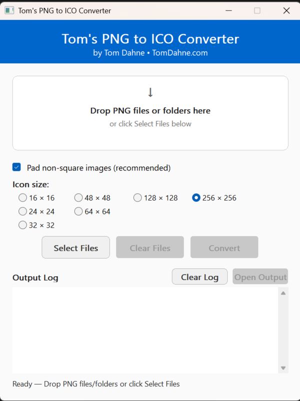
How the PNG to ICO tool works
The workflow is deliberately simple. Run the EXE — no installer, no setup, no dependencies. Drag and drop one or more PNG files (or an entire folder) onto the application window. Select your target icon size from the dropdown. If your source image is not square, choose either Pad or Crop mode to handle the aspect ratio. Click Convert.
The tool automatically creates an _icons folder next to your source images and saves the converted ICO files there with the same filenames. The entire process takes a few seconds per image, and batch conversions of dozens of files complete in under a minute.
Pad vs Crop for non-square PNGs
Icons must be square. If your source PNG is not square — a tall logo, a wide banner, a portrait-oriented illustration — the converter needs to make it square before creating the ICO. There are two approaches, and the right choice depends on your image.
Pad mode is the recommended default. It keeps the entire image at its original proportions and adds transparent space around it to fill the square. The result is an icon that shows your complete design centred within the icon frame. This is the right choice for logos, badges, and any image where cutting off edges would lose important content.
Crop mode centre-crops the image to a square, filling the entire icon area with image content. This produces a more visually prominent icon but may cut off the top, bottom, or sides of the original image. It works well for images where the important content is centred and the edges are expendable.
If your logo has text near the edges, use Pad mode. Crop mode will cut into the text and produce an unusable icon.
Best Windows icon sizes and where they appear
Windows uses different icon sizes in different contexts. The table below shows the standard sizes and where you will encounter each one in the Windows UI.
| Size | Best use |
|---|---|
| 16×16 | Small toolbar icons, legacy UI elements, title bar icons |
| 24×24 | Some application UI elements and menu icons |
| 32×32 | Common application icon size, default desktop shortcut size |
| 48×48 | Desktop shortcuts at medium icon view |
| 64×64 | High-DPI UI elements and notification area |
| 128×128 | Large preview thumbnails |
| 256×256 | Windows Explorer large and extra-large icon views (recommended) |
Tip: If you are unsure which size to use, go with 256×256. Windows scales down cleanly from a high-resolution source, and this size covers every modern display context including high-DPI monitors.
Why a single-size ICO is usually enough
Some icon tools generate multi-size ICO files that bundle several resolutions into one file. This was more important in older versions of Windows where scaling algorithms were less sophisticated. In practice, modern Windows (10 and 11) handles downscaling from a high-quality 256×256 source extremely well. A single clean 256×256 ICO file covers virtually all use cases without the added complexity and file size of a multi-resolution bundle.
The exception is if you are embedding an icon into an application executable where you need pixel-perfect rendering at specific small sizes — in that case, a multi-size ICO with hand-tuned versions at 16×16, 32×32, and 256×256 is worth the extra effort. For desktop shortcuts, folder icons, and most practical uses, a single 256×256 is the right choice.
Best practices for clean icons
Start with the highest resolution source you have — 512×512 or larger is ideal. Use a PNG with a fully transparent background rather than a solid colour. Keep important details like text and fine lines away from the edges of the image, because icon contexts add padding and any content near the edge may be clipped or rendered too small to read. Avoid using a tiny source image and scaling it up — upscaling introduces blur that no conversion tool can fix.
If you are creating icons for a set of related applications or folders, use consistent sizing, padding, and colour palette across the set. A cohesive icon set looks professional even at 16×16 pixels.
Troubleshooting
If your output icon looks blurry, the source PNG is too low resolution. Go back to a 512×512 or larger source and convert again. If the icon has a black or white background instead of transparency, your source PNG does not actually have a transparent background — open it in an image viewer that shows transparency as a checkerboard pattern to confirm. If there is no output file after conversion, check the _icons folder that the tool creates next to your source images. If your Windows icon does not update after assigning a new ICO file, Windows caches icons aggressively — restart Explorer (via Task Manager) or clear the icon cache to force a refresh.